
DB Rebrand
Transforming a Typographic Logo to a Graphic Logo Solution.
Self initiated project

Case Study
Objective:
Client currently has a type logo solution. They have international product reach. Create a graphic logo that has a look and feel of a universal icon would be ideal.
Client:
Diamondback Bicycles.
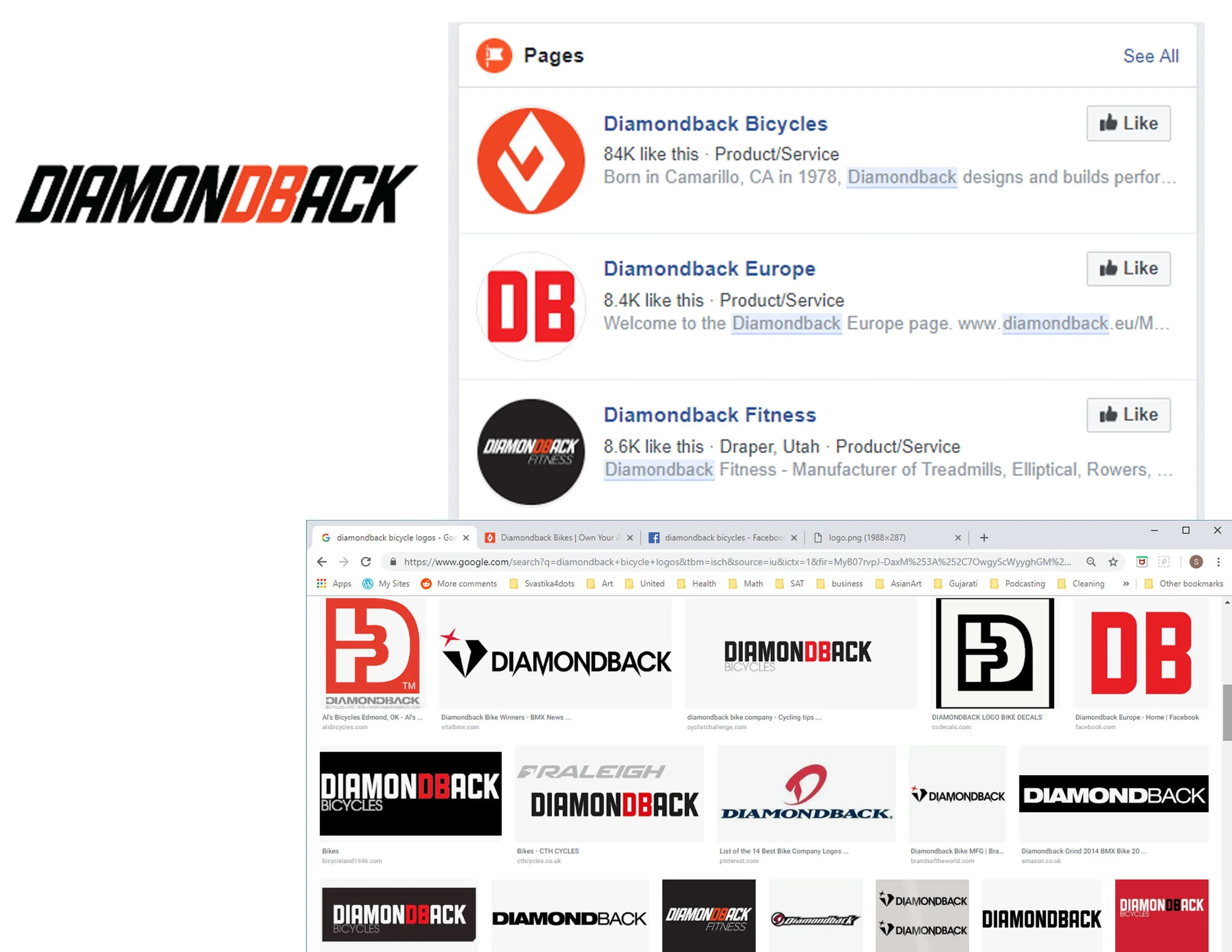
Variation of current typographical logo solutions for DB found online.
Process:
I researched that Diamondback Bicycles has a graphical logo but it still uses a typographical solution.
My version of a typographical logo solution.
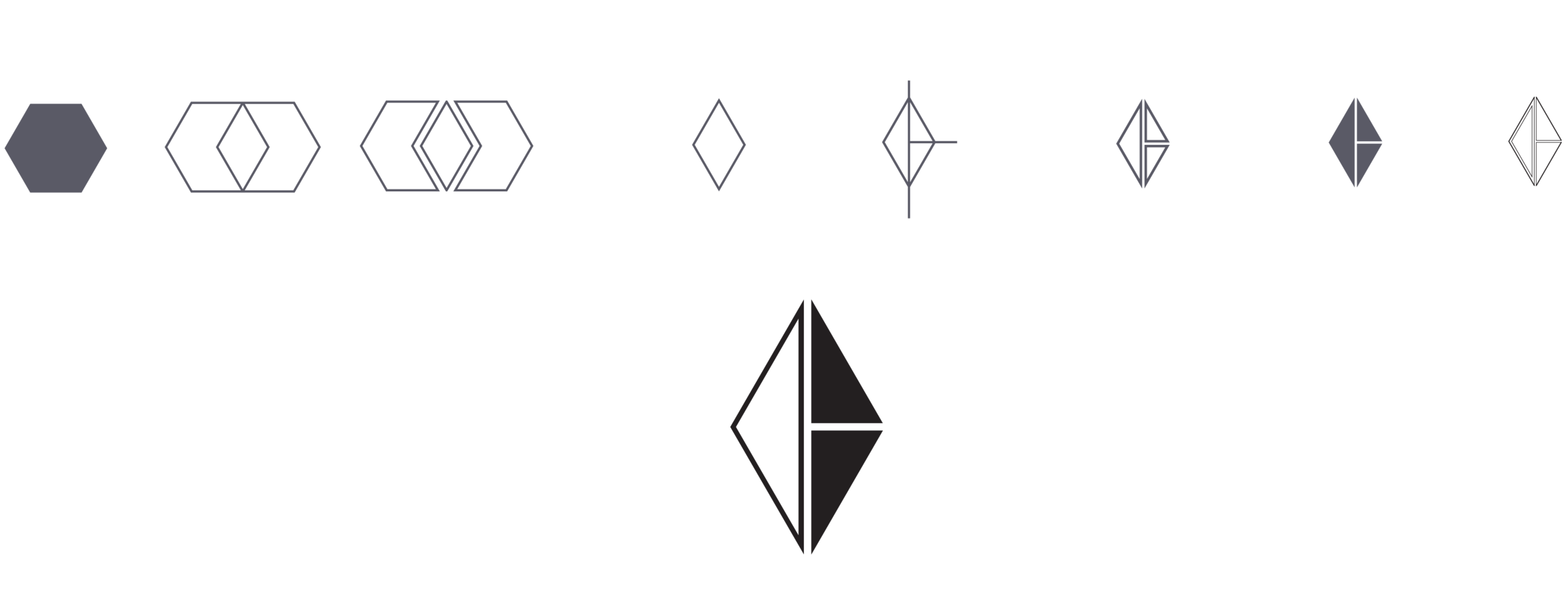
The backward D and forward facing B are embedded in the logo.

Visual steps on how the DB graphical logo solution was created.
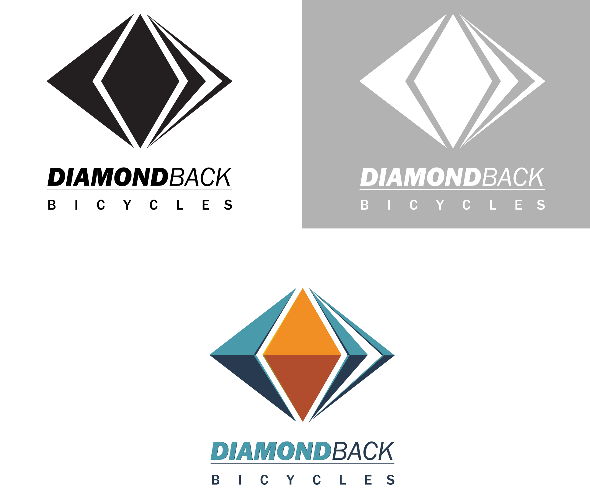
Solution:
The hexagon split revealing a diamondback shape. The middle diamond + the left arrow = diamond back; the right side triangle was kept and further split up to indicate going forward because the bike is a mode of transportation.
Also during research the diamond shape also correlates to the Diamondback snake’s head.
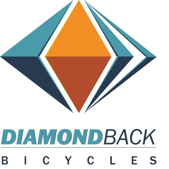
DB logo color with 3d look. The colors selected was from research of where a diamondback snake resides in the dessert climate. The warm earthy tones of the ground, (orange-red), juxtaposed with the cool blue sky colors.
Basic Brand Guidelines:

Typography:

Why was Franklin Gothic Font family chosen:
Sans-serif, clean, easy to read
Nice weight variation for hierarchy
Italics give a dynamic feel
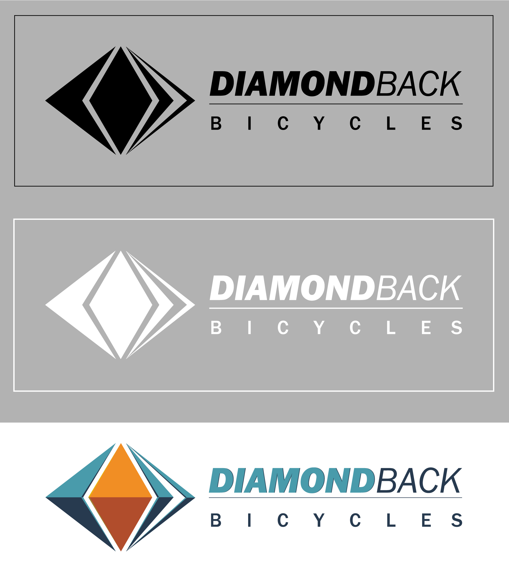
Logo Applications:


