Getting Positive Qualitative Results through Branding…

Case study
Client:
Ozark Natural Grilling Pellets
My Contribution:
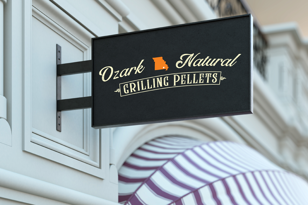
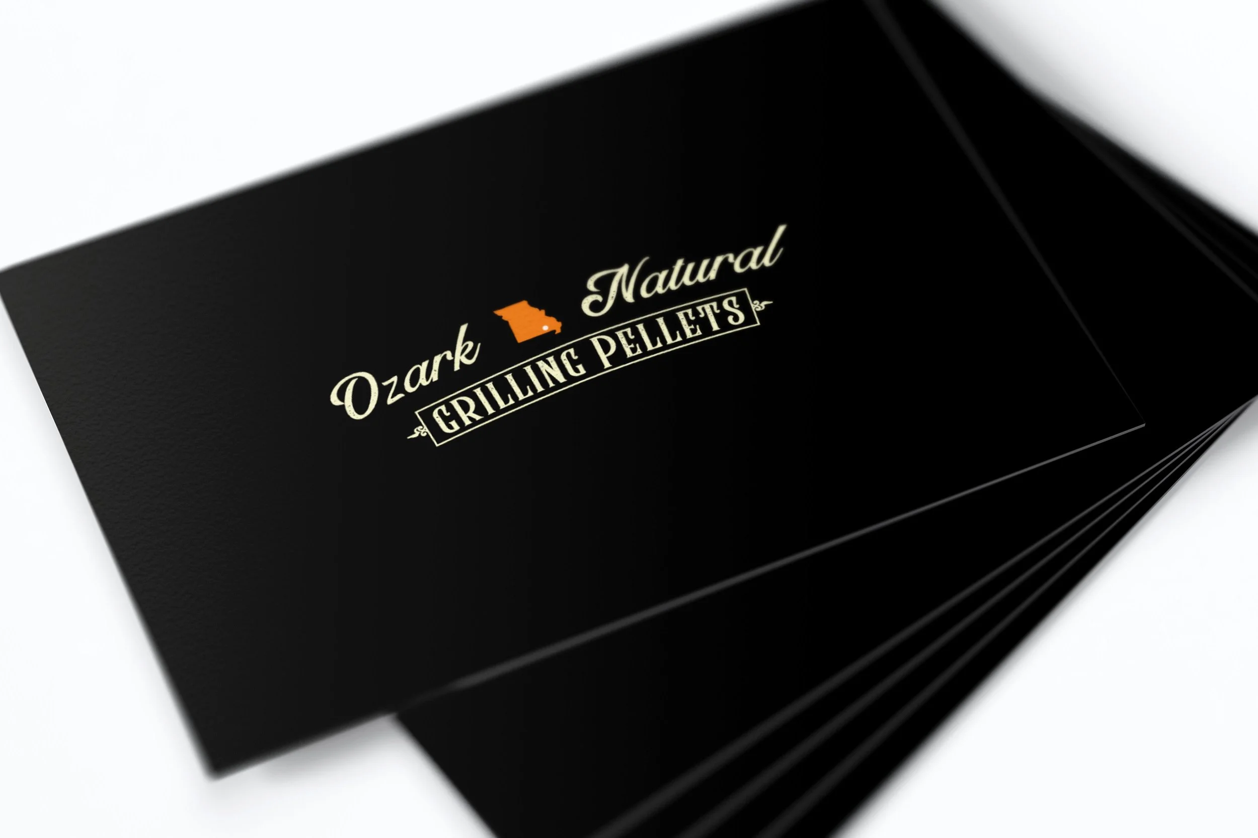
Logo Design
Super Premium Seal
Usage of product icons
Package Design
Print Collaterals
Background:
Ozark Grilling Pellets is a family owned business with roots in lumberjacking. In recent times they have found a market in creating high quality grilling pellets for consumer use.


Life-style imagery.
Objective:
Their original saw logo and package design had served their function but they wanted to communicate the high-quality aspect of their brand. Their brand is for the fun relaxed backyard outdoorsy personality who enjoys the flavors from grilled foods that is worthy of a Pitmaster. Their brand colors of black orange and white had to remain. A new logo and package design was needed.

Original ONGP Package DesignProcess:
Ozark Natural Grilling Pellets (ONGP) original logo was a saw. The owners wanted to keep some element of the saw. Eventually, we started thinking about representing the brand as their version of the 3 pigs, each pig being a personification of the three owners. It was decided the pigs were not communicating the high quality that they wanted to be known for.

The iterative sketch process:
Logo sketches using the original blade logo


BBQ pig studies
Grilling Pellets close up.

ONGP Final Package Design
Font’s used in the logo, element placement and colors used
Logo font gives a hand written feel, yet professional and classy
Body copy is a simple sans-serif font are easy to read.
Bar code placement toward the bottom for ease of scanning at checkout.
The Classic Blend text with orange rectangle is the one place that would be swapped out for different colors corresponding with the different flavors.
Application of approved logo on the newly designed Polybag.Impact
Although I did not see the quantitative results of the package design, the owners had said they received many compliments and had, “the best looking bags on shelves!” The qualitative results were positive.
Logo Application: